

Redefining an Icon:
The New BMW Brand Identity
For the first time since 1998, BMW, BMW M, and BMW i underwent a comprehensive redesign of their visual identities. This transformative project was a collaboration with BECC Agency, led by its CEO, Leif Geuder, and a creative team focused on aligning the brand with modern communication needs. The redesigned identity simplified logos, optimized the corporate typeface, and introduced a reimagined color system, reflecting BMW’s core commitment to customer centricity. These efforts earned a Red Dot Award, showcasing exceptional innovation in brand design.
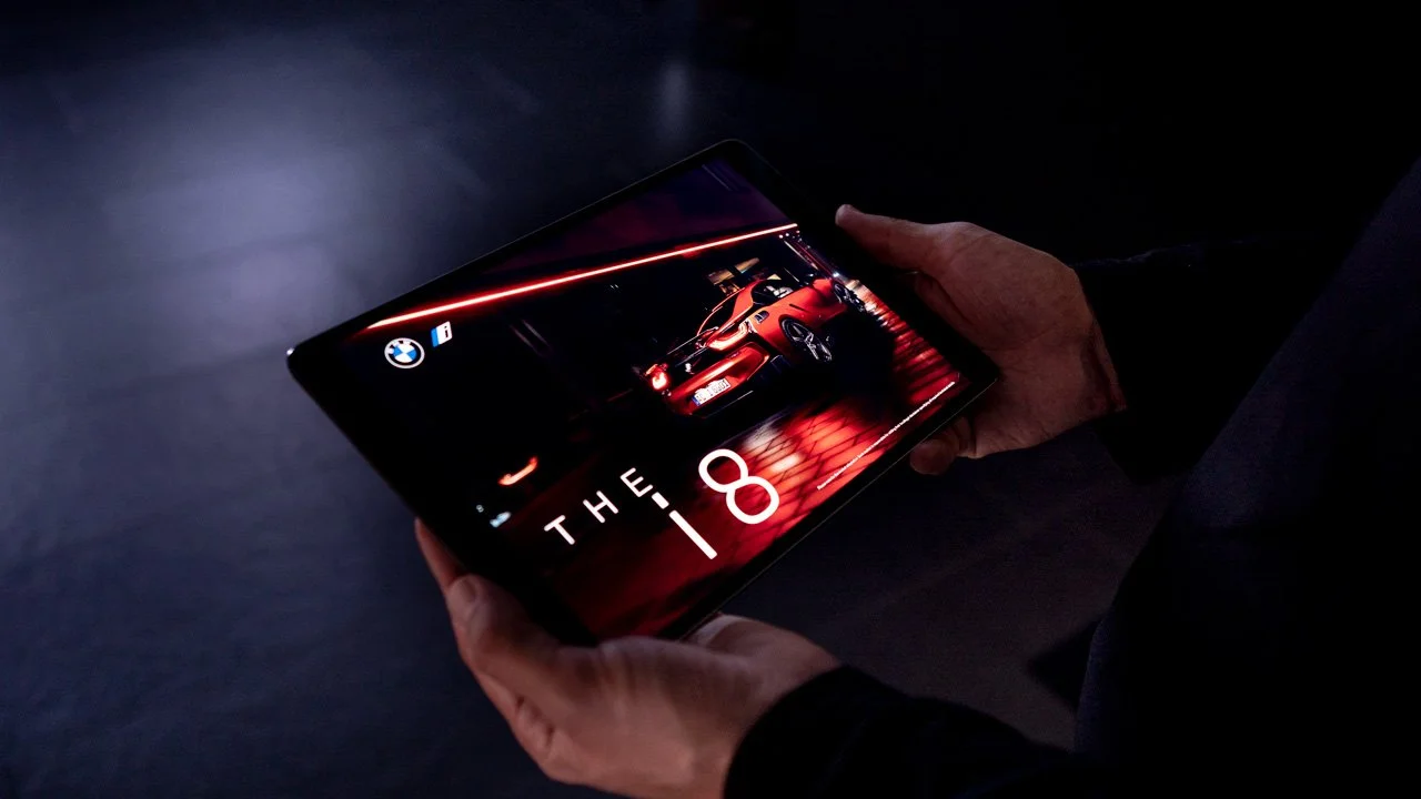
Person holding a tablet displaying an advertisement for the BMW i8, showing a red car inside a dark garage or showroom.
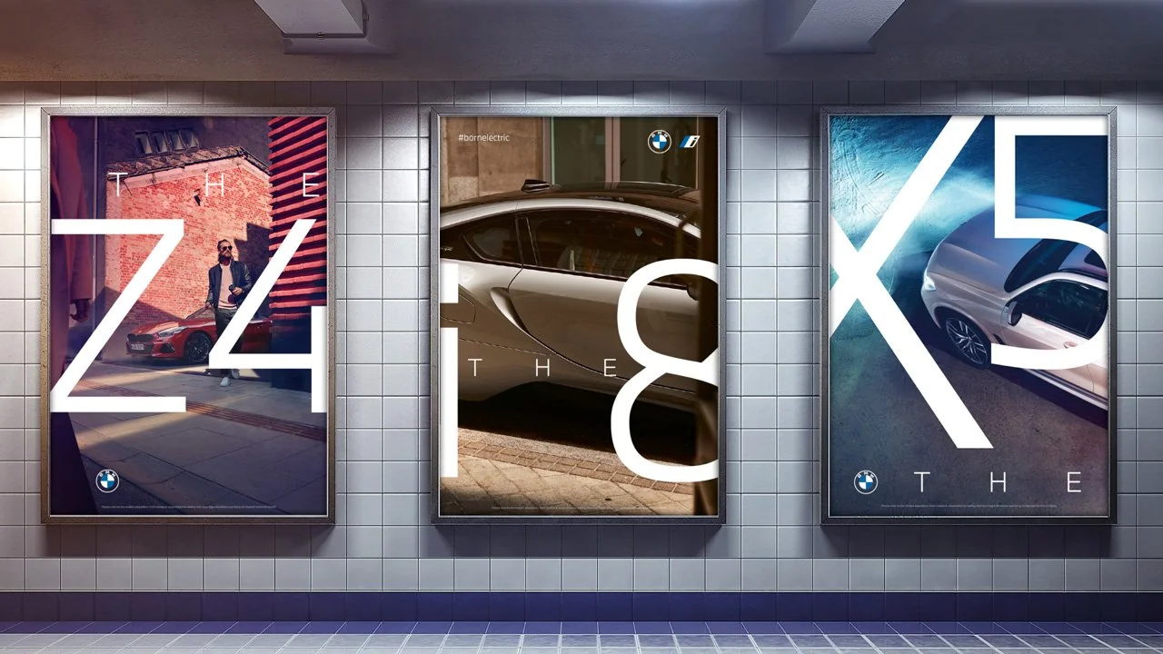
Three BMW car advertisements displayed in a subway station, with large white letters and numbers overlaid on the images.
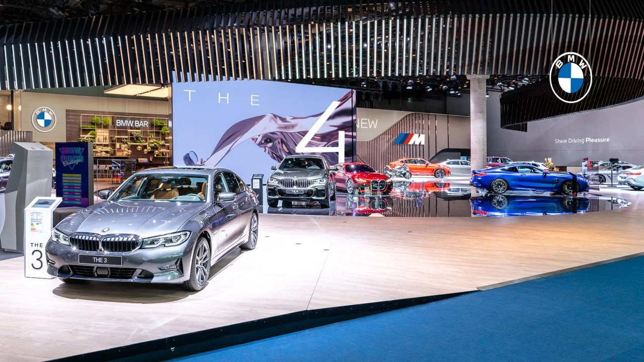
An auto show display featuring BMW and BMW M models, including a silver BMW 3 Series in the foreground, and other BMW cars in various colors behind it, with BMW logos and promotional signage.

A tablet displaying BMW car images and social media profile, placed on a desk with a wireless keyboard, headphones, and a closed notebook.
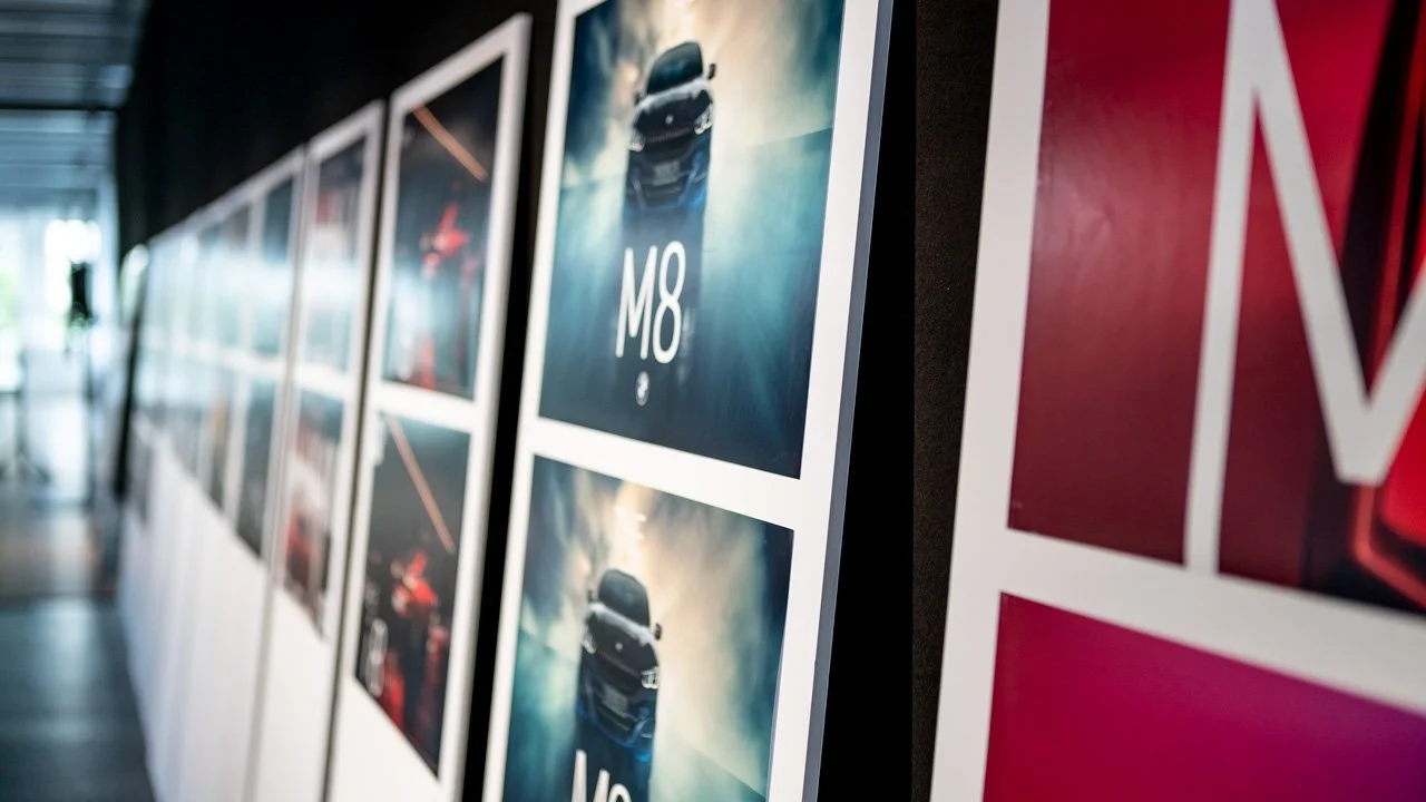
Photographs of a car model displayed on a wall at an exhibition or gallery.

Large digital billboard on the side of a modern building displaying a BMW car advertisement with the text 'THE 8'.

Large billboard on a building advertising BMW M8 car with a red background and a blurred image of the car in motion.

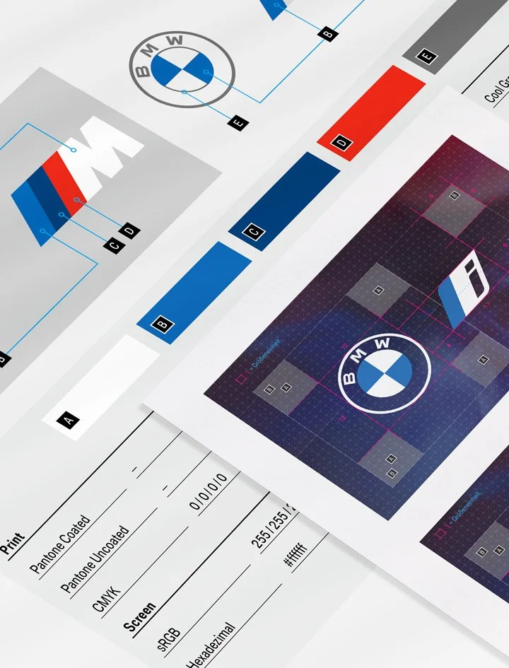
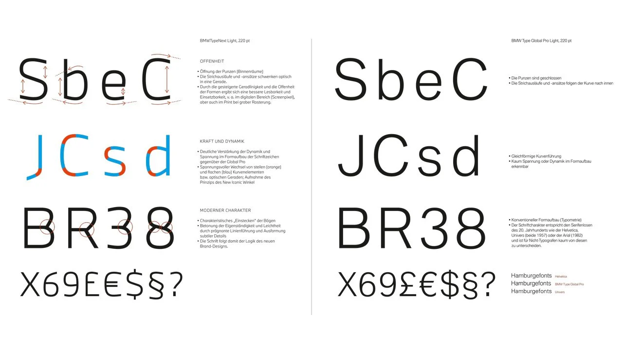
The collaboration with BECC Agency began by establishing foundational concepts for BMW’s new identity, driven by Leif Geuder’s strategic vision and the creative team’s expertise. The logo redesign focused on radical simplification, replacing the black ring with a transparent area to symbolize openness and a direct connection with customers. The optimized typeface enhanced readability and added a distinctive, modern character to strengthen the brand’s visual identity.
A streamlined system harmonized BMW M and BMW i with the core brand, ensuring a cohesive and recognizable connection across all platforms. Later stages of the project refined motion graphics guidelines to ensure a dynamic and consistent digital presence. This comprehensive transformation modernized BMW’s identity while preserving its legacy, positioning the brand as a leader in customer-focused innovation.

Customer Centricity First
BMW began with a simple ambition: create a symbol that reflects genuine customer orientation. The answer came through radical reduction. The ring of the logo became transparent, creating a visual bridge between the brand and the world of the customer. Its minimal form not only simplifies usage but brings an authenticity that holds up across every medium.
A Cohesive Family
The redesigned system unifies the symbols of BMW, BMW M and BMW i. Their relationship to the core brand is now unmistakable, making BMW the focal point in every application. These marks are used exclusively in print, digital communication and spatial experiences such as events and trade shows.
A Typeface for a New Era
BMW’s brand identity is further defined by its new typeface, completely redesigned for clarity and character. The previous technical aesthetic has been replaced with a lighter, more distinctive voice that reinforces BMW’s personality in every line of text.
Principles that Unlock Creativity
Instead of rigid rules, the new identity introduces guiding principles that give designers far more creative freedom. The result is communication with greater individuality, emotion and expressive strength, while maintaining brand coherence.
Built for the Future
Refreshing an icon like BMW demanded new thinking at every stage. Through a collaborative process, we developed solutions that supported the brand throughout its transformation. The result is a design system that puts the customer firmly at the center and positions BMW confidently for the road ahead.

Key Aspects of the Project
1. Customer-Centric Design
The redesigned logo reflects BMW’s commitment to putting customers at the heart of its identity. The transparent ring symbolizes openness and connection, ensuring the brand resonates on a personal level.
2. Unified Brand System
The integration of BMW M and BMW i into a cohesive visual system harmonizes sub-brand appearances. This ensures a clear and unified connection to the core BMW brand across all platforms and media.
3. Creative Freedom with Structure
The new brand principles replace rigid guidelines, offering greater flexibility while maintaining a consistent identity. This approach allows for more expressive and engaging communication, aligned with BMW’s innovative spirit.